
Karel Martens: Re-Printed Matter
(Copyright © Karel Martens, 2020)
He may be 81 years old, with a career spanning 60 years and counting, but Karel Martens is still of the mindset that his work can always be better.
Originally published back in 1996, the monograph was an instant classic in its extensive survey of the prolific graphic designer’s career. As well as co-founding the two-year master’s programme at Werkplaats Typografie, with Wigger Bierma in Arnhem, Karel, a central figure in the Dutch modernist movement, seems to have designed it all. Throughout his impressive career he has turned his hand to stamps, coins and films – not to mention every other graphic design staple, from books to corporate identities.
Karel could have easily developed an ego, so it’s refreshing to hear someone of his stature freely admit that “sometimes you still make the same old stupid mistakes.” It’s this criticality that drives him to keep making work, but that also on the flip side prevents him from looking back at old projects with nostalgia. For him, mistakes give rise to unexpected surprises, especially those made on the computer, a technology established decades into his career. “It can be a nice surprise or not so nice a surprise,” he says, “but by making mistakes, sometimes you feel like, wow, where did that come from?”
There is nothing negative associated with the mistake for Karel. It may be a cliché, but the proof is in the pudding. He’s someone who views no difference between artist and designer (just the label) and through his unique way of seeing, creativity is “all about the person”. By this, he means that creativity is the antithesis of dogma. Making work is “all about trying and discovering” and in his opinion, “there are no truths.” He uses the example of a garden. When creating a garden, the common law dictates that the big plants go at the end and the small ones in front. But what if the other way around is more interesting?
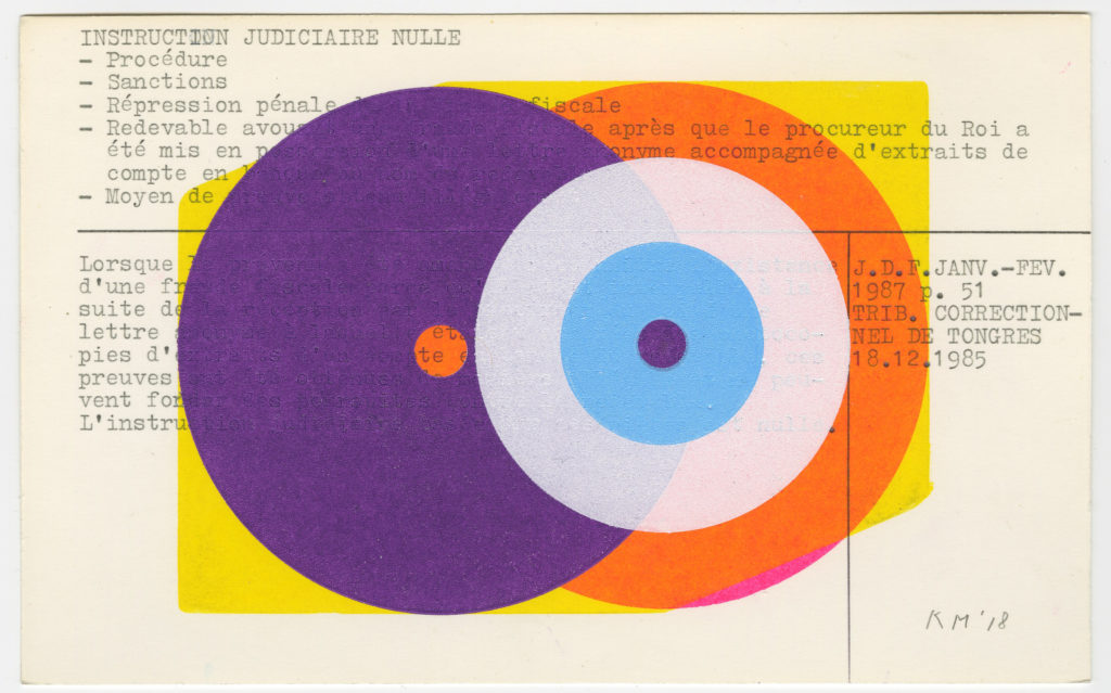
Famous for his sense of experimentation, there are countless projects we could cite now to demonstrate the Dutch master’s way of thinking. We’ll just mention a few that helped cement his reputation for type and print: the design of OASE Journal for Architecture, where Karel explores the relationship between graphic design and architecture, a role he took up in 1990; his well-known symbol generated cloud images, formed by the tight repetition of intricately designed rosettes; and perhaps most infamously, his ongoing work with the Stedelijk’s print collection where he repurposes old archive cards to become diplomas for Werkplaats Typografie graduates.

Karel Martens: Re-Printed Matter
(Copyright © Karel Martens, 2020)
“I am from the generation where the computer came to us later in life, even though it’s not that long ago in historical terms. But I am thinking it’s not for me, it’s for the new generations. There is a lot of knowledge that I don’t understand,” he says.
To process this, he made a movie, a way for him to do something with the experience. At the time, he was working on a university lecture and as he always does, he pinned reference images on the wall as an “extension of memory”, an archive of sorts. Karel’s daughter – who incidentally is also a graphic designer – took pictures of the wall, every ten centimetres to make into presentation slides. And after the lecture, a pupil asked to have a copy of the slides, which for Karel, meant using a scanner for the first time.
Karel isn’t afraid of stepping out his comfort zone, no matter what stage of life. His ability to introduce a new medium by looking at an image from a different angle is just one of the many reasons why his portfolio to date is so diverse. When Karel first launched his career after studying fine art at the Arnhem Academy of Art and Industrial Arts in 1961, the industry was completely different to the screen-based discipline it is today. Back then, he would hand draw type as small as point sizes eight or nine. A far cry from the technological simplicity of today, when you hit a button and a letter appears before you.
“So I started making scans of the slides and it ended up being the wrong resolution, the wrong cropping,” he says. When those first attempts at scans landed on Karel’s computer’s desktop, it was “a mess” – as he puts it, “full of shit, full of the wrong things”.
For Karel, however, the latter process is more difficult. “I discovered everything through reflecting. There can be a lot of rules in the game,” he says on the act of designing, “but you have to order them and kind of sort them out. I think limitation is an important thing.”
Present technology erases many of the limitations that were present in the pre-Adobe design era. But for Karel, it’s imperative to remember that graphic design was born out of restriction; restriction of what the hands can do with print. So the fundamentals of the art remain much the same for this new era. The process of graphic design can be boiled down to this question posed by Karel: “How many different elements do you need to tell the story?”
Karel Martens: Re-Printed Matter
(Copyright © Karel Martens, 2020)
The story doesn’t have to be 100 per cent accurate, though. The designer can “lie a bit” or cut corners in the information they hold back from the viewer. That’s also part of the script – don’t tell the total story so the viewer can hook onto the missing details. In graphic design, the work is outward-facing, for the public. In some ways, the aim is to engage them and make them feel part of a story mid-climax. As Karel puts it more broadly: “Curiosity is a very important thing for a human being. If you see a book on the shelf, you should become curious. Absence in design is very important, the things you don’t see. But designers can offer a set of ingredients and allude to certain things.”
With so many options readily available nowadays at the click of a button, in Karel’s opinions, a design can feel “too complete”. After all, the computer is mimicking something that was first crafted by the human hand. He expands on this notion of over-completeness: “Too many colours, too many shapes, too many ideas. It is harder but more important to take a small part of [a design] and make it clear as a kind of hesitation, or suggestion.”
Hero Header - Karel Martens: Re-Printed Matter
(Copyright © Karel Martens, 2020)