
The Autobiography of Eikoh Hosoe Trilogy Box Set
(Copyright © Zhihong Wong, 2020)
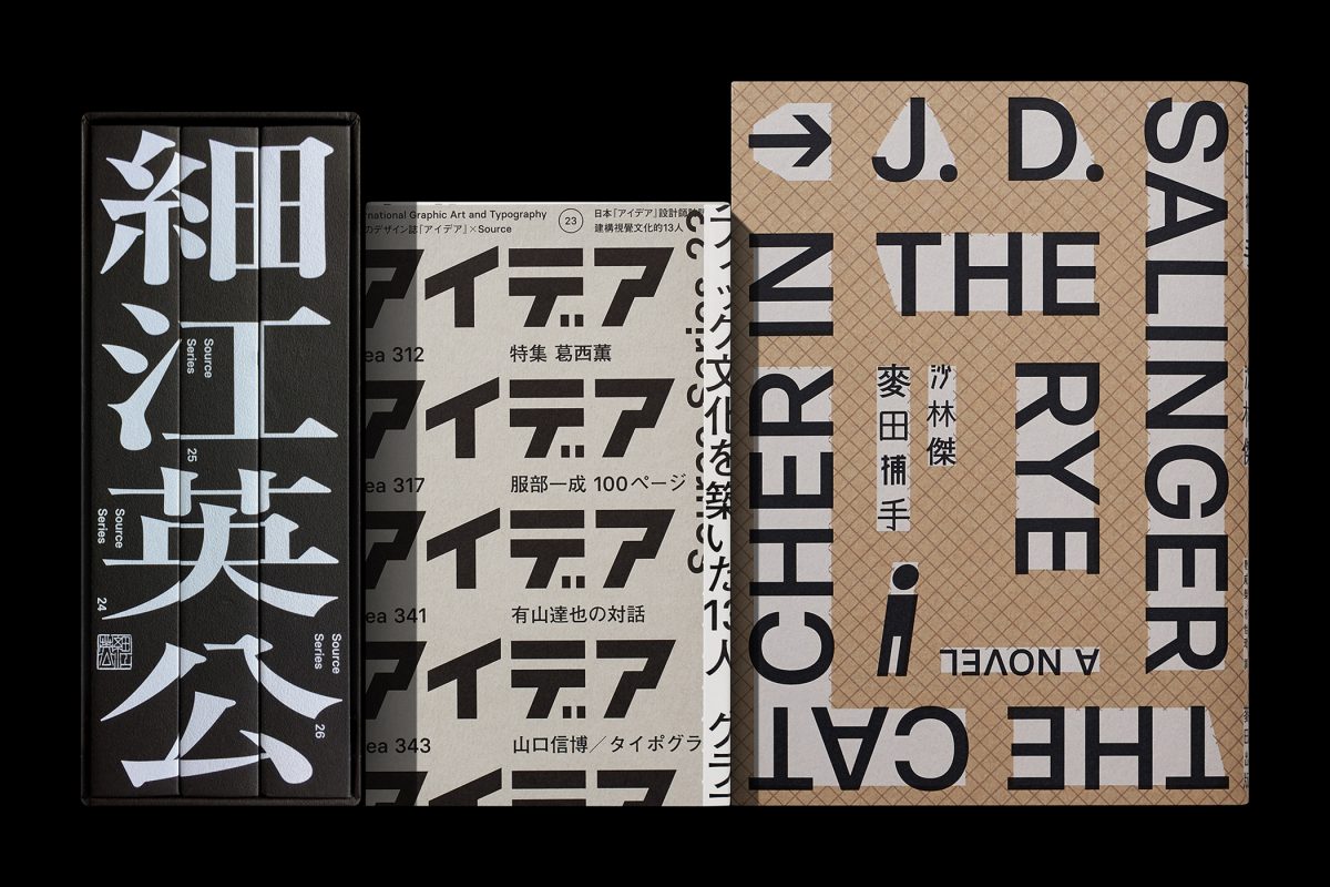
It’s been over two years since we last wrote about the elegant work of Taiwanese graphic designer Wang Zhi-Hong. A leading designer in his field, Wang’s designs have always centred on books – and still do – but the past year or so has seen him opening up his practice to include “other collaboration possibilities”. For example, in 2018, he designed visual identities for Hong Kong International Photo Festival and for an exhibition by Lars Müller Publishers in Taiwan. One thing has remained the same throughout his shifting practice, however, and that’s an appreciation of typography, particularly of Chinese characters.
A flick through Wang’s portfolio is satisfying for anyone with a penchant for graphic design, as he cleverly combines shape, image and text, often treating the latter as an illustrative element. It’s a style his eponymous studio has become well known (and loved) for over its 19 years of existence.
With that much experience under his belt, Wang is now starting to look at different ways he can approach designing. “In recent years, I’ve tried to adjust how much information is included in the design, or the way to speak out, hoping for more focused results,” he tells us. This has resulted in more synthesised designs, often with a more pared-back colour palette or a more considered use of letterings on a page. Wang himself describes this as a “hiding of information”.
Still using his main interests of “photography, architecture, art, etc” as starting points to inspire projects, Wang cites his identity for the Hong Kong International Photo Festival as a recent favourite project of his. “Because for a very long time I’ve been paying close attention to the photographers and their explorations into redefining the aesthetics of photography this festival signifies,” he adds on why this is. “And I’ve helped publish several books about this movement. That’s exactly why HKIPF assigned me to design for the project.”
Largely monochromatic in black and white, the identity sees the words “Provoke & Beyond” set in both English and Chinese and overlapping work from the festival. There’s a haphazardness to the design as different elements collide, almost as if misprinted. This, Wang explains, was done to invoke “disorder and carelessness”, ideas representative of the Provoke movement in 1960s Japan. It’s a solution which shows the awareness Wang approaches his projects with, turning research into nuanced design decisions which embody a concept, although not always in the most forthright way.

Lemon, Motojirō Kajii, 2019.
(Copyright © Zhihong Wong, 2019)

The two sides of this paper show different characteristics.
(Copyright © Zhihong Wong, 2019)
The story doesn’t have to be 100 per cent accurate, though. The designer can “lie a bit” or cut corners in the information they hold back from the viewer. That’s also part of the script – don’t tell the total story so the viewer can hook onto the missing details. In graphic design, the work is outward-facing, for the public. In some ways, the aim is to engage them and make them feel part of a story mid-climax. As Karel puts it more broadly: “Curiosity is a very important thing for a human being. If you see a book on the shelf, you should become curious. Absence in design is very important, the things you don’t see. But designers can offer a set of ingredients and allude to certain things.”
With so many options readily available nowadays at the click of a button, in Karel’s opinions, a design can feel “too complete”. After all, the computer is mimicking something that was first crafted by the human hand. He expands on this notion of over-completeness: “Too many colours, too many shapes, too many ideas. It is harder but more important to take a small part of [a design] and make it clear as a kind of hesitation, or suggestion.”
A common denominator that runs throughout is Wang’s love of function and form. His mission, so to speak, is to search for possibilities in Chinese characters and multilingual environments that are “logical and widely integrated with commercial cases,” he notes.
This includes publications, which he’ll use to speak to consumers and raise awareness of the potential of typography. “When I entered the design industry in the late 90s, my initial goal was to provide the market with more quality products that would make typography a valuable element to consumers,” he continues. “Years later, even though the design environment in Taiwan has changed, and the emphasis on typography has increase each year, the idea continues to drive me forward.”
Clever, minimalist and often shrouded in detailed considerations – the sort that goes amiss in the first observation – Wang’s new portfolio is as intricate as ever. Only this time, culture, history and context plays a much bigger role. In Praise of Shadows, for instance, the third book he’s designed for Junichiro Tanizaki. A “masterpiece” for understanding Japanese aesthetics, Wang wanted to bridge the gap between the reader and the content – “both old and new readers, in the East and the West,” he shares.
“The atmosphere is particularly important at this moment, when it is necessary to keep a safe distance from traditional impressions and not to be completely influenced by the temporal context.” In this regard, Wang uses a structural mix of lines and type as a nod to the Japanese “spatial contours”, conceived in a monotone palette of grey and black and emphasised in dark paper. This allows the reader to “immediately enter the dark space”, to “feel the texture” and make new discoveries through the subtle markings, and hints of light and shadow.
The typographic form might not be the first thing you notice in Wang’s work, or maybe it is; either way, it plays an integral role in all of his projects whatever the brief or outcome. “I want the viewer to feel that, even though the text is not the focus of the image, it is still recognised as an essential and important part.”
Hero Header - Wang Zhi-Hong: In Praise of Shadows
(Copyright © Wang Zhi-Hong Co., 2022)